
A love letter to the Inverse web design team.
Sep 30, 2022 by Gabe Hilliard
Inverse is one of my favorite places to peruse random articles – honestly not because of the articles themselves (though they are great) but becuase of how amazing the design is. They brilliantly combine quality images, gritty gradients, clean typograhy, and imaginative layout design. Let's take a look at each of these.
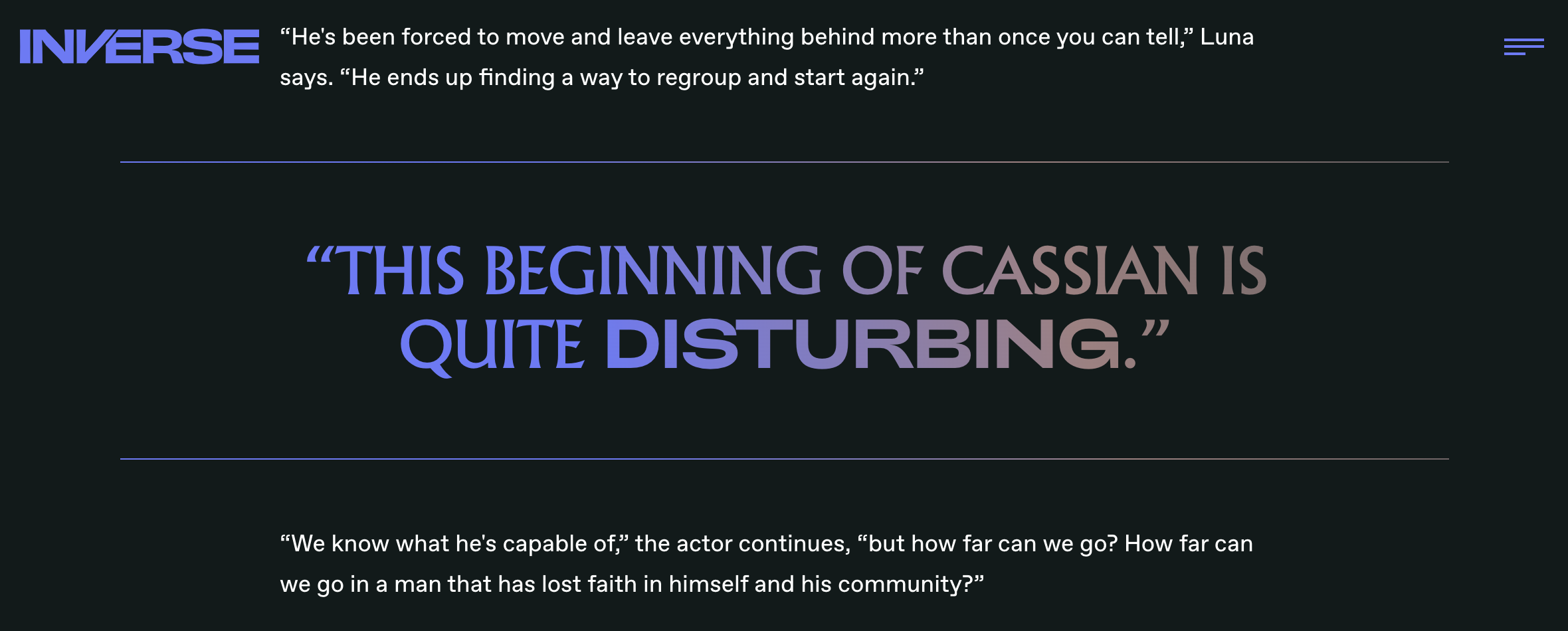
The fonts might actually be my favorite part. In this first headline, they use an italicized font, a normal font and then bring in a whole other font just emphasize a single word. I think the contrast between the two fonts used in the same area is really brilliant. The second example is a pull quote from within an article. I love the gradiated colors and again how they bring in the second font for emphasis. They treat their typography as an expression of art all its own.
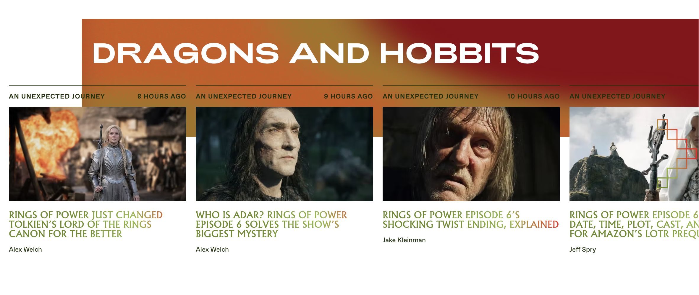
Lastly, we have these dynamic layouts. I love that the large area of color is a bit offset from the left side of the page and cuts right into the text "An Unexpected Journey." Honestly, sometimes design choices like that can make legibility difficult, but it feels like the Inverse team is saying, "We know it may be a bit tricky to read. We know you can figure it out because the design looking really sick was totally worth it."
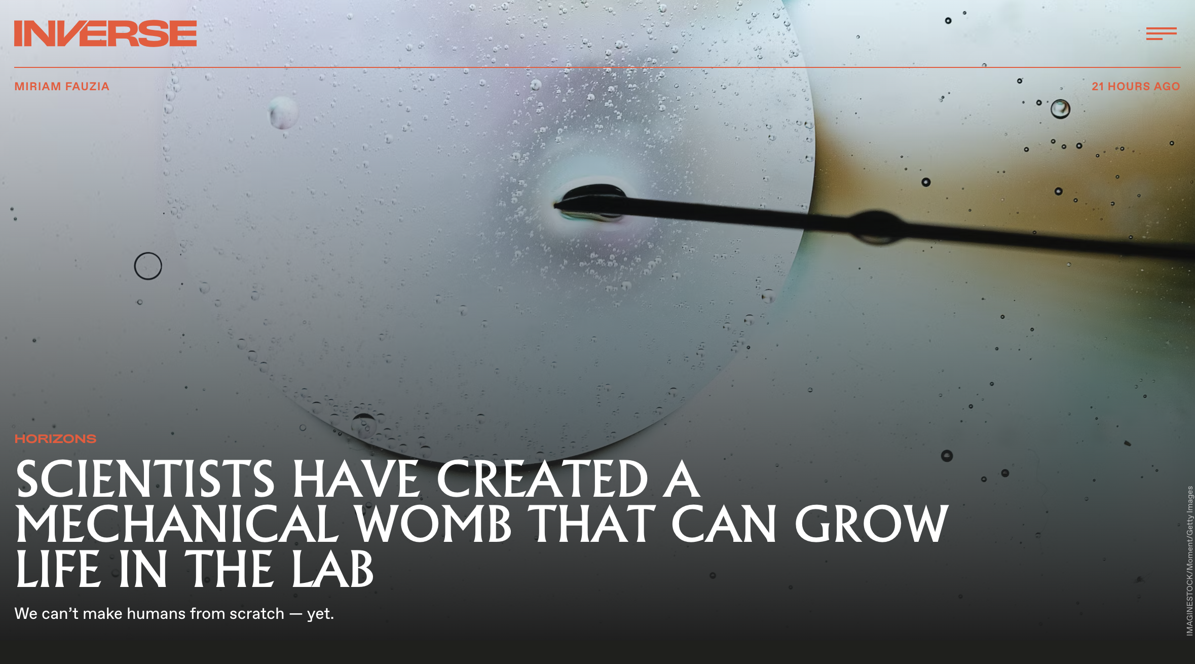
Quality Images
Look how intersting this image is! Upon reading the title of the article, I'm a little freaked out but I might just click in because the image is so interesting and compelling. With this being an article about scientifically growing a human embyro (I told you - freaky), they could have used a generic picture of a baby or a diagram of a fetus but you can tell they really serached for a dynamic image that draws the viewer in.
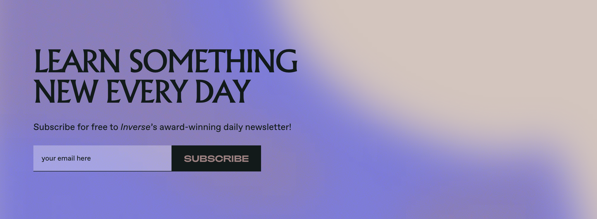
Gritty Gradients
Subtle gradients like this are really in right now (just look at the one at the top of this page!). What makes them so effective is that they add a lot of interset to a section without taking away from the legibility of the text. And it's not a simple gradient that goes straight from one color to another. Theres a lot of variety to how the color changes.
Clean Typography
The fonts might actually be my favorite part. In this first headline, they use an italicized font, a normal font and then bring in a whole other font just emphasize a single word. I think the contrast between the two fonts used in the same area is really brilliant. The second example is a pull quote from within an article. I love the gradiated colors and again how they bring in the second font for emphasis. They treat their typography as an expression of art all its own.
Imaginative Layouts
Lastly, we have these dynamic layouts. I love that the large area of color is a bit offset from the left side of the page and cuts right into the text "An Unexpected Journey." Honestly, sometimes design choices like that can make legibility difficult, but it feels like the Inverse team is saying, "We know it may be a bit tricky to read. We know you can figure it out because the design looking really sick was totally worth it."